


As part of our mission to enable our customers to build better, we’ve spent the last few months diving into the details of how our most successful users work. We’ve been using this research to inform a slew of new enhancements. Today, we’re really excited to pull back the curtain on two powerful enhancements inspired by our own users that we couldn’t keep to ourselves!
In my own days as a product design engineer, I remember feeling like I was literally doing two jobs: my “China job” to try to make as much progress as possible in identifying and resolving issues during the build and my “Cupertino job” trying to keep on top of my email and communicate effectively with my broader team back at home base. Add in a dose of jet lag and I definitely wasn’t operating at my best. For engineers who are monitoring development builds or driving continuous improvement in production, it seems there is an endless list and so ruthless prioritization is par for the course.
The most successful Instrumental users and teams have integrated Instrumental into their various workflows. They use our algorithms to identify defects and setup tests to monitor for those defects over time. They review the new units those tests have caught each day, and then choose which problems they will tackle based on their own complex formulas of failure rate and criticality. In some cases, our users “hacked” both their routines and how they use the Instrumental application to build workflows that they self-describe as “twice as efficient”. We want all of our users to see these kinds of efficiency gains, and so we dug in with these users to see what we could learn.
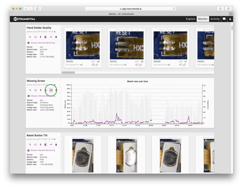
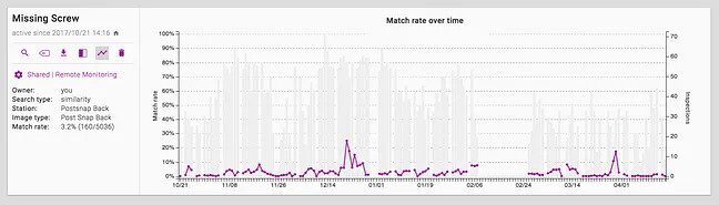
One of the key best practices we saw in our most successful users was an understanding of the context in which failures occurred and ongoing ruthless prioritization of how they spend their time. Engineers and Engineering Program Managers alike log into Instrumental wanting to see what’s new and whether the trend for an individual issues is going up or down. “If the trend is going up,” described one mechanical engineering leader, “that becomes a top priority. I will follow up with my teammates to see if we’ve issued instructions for a corrective action. If we have tried a corrective action, and the trend isn’t going down, we know it didn’t work and can try to figure out why.”
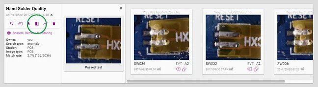
To better support this prioritization workflow, we’ve added an easy way to see the defect rate relative to input over time. To see the graph, navigate to the specific test of interest on the Monitor tab, and click the trend icon. The graph shows time-series data for input counts and failure rates, so you can easily see if you’ve been making progress on stamping out the failure mode. If the failure mode is new to you and you’re not sure what a good unit looks like, you can also toggle the compare icon to see a photo of a representative passing unit.
We’re excited to release these enhancements as part of a set of rolling releases of advanced functionality over the next couple of weeks. The next release is just days away! We look forward to hearing your feedback on how Instrumental can help you and your team build better.
If you’d like to receive more best practices like this, direct to your inbox, sign up for our blog in the green box below!
Author
Related Topics