Pantone recently announced their colors of the year for 2021: Ultimate Gray, a soothing and shadowy steel, and Illuminating, a beautiful and hopeful yellow. If you’re planning to incorporate one of these shades or a new color into your products next year, make sure you know what you’re getting into. With all the uncertainty around travel restrictions and COVID-19, you have to be extra prepared to put in the time to get that perfect color. Read this guide to learn a few color matching best practices for your upcoming product builds and designs and head to Pantone to read more about color matching theory.
A quick primer on color matching and product design
After many years at Amazon, I joined PillDrill as the 5th employee to shepherd our health-tech product from concept to production. The team decided on bright teal as our brand color which we quickly splashed onto our slick teaser website. This teal and five complementary tones looked great on screen, so our industrial designer liberally used them to craft beautiful digital renderings.
But when the time came to turn those renderings into a real product, we ran into trouble matching the different components and substrates in our system to the bright hues the team had selected. When I should have been focused on buttoning up our final production processes, I instead found myself learning about color the hard way, poring over different part samples chasing that elusive perfect shade of teal. I’m sharing what I learned in the hopes that you don’t make the same mistakes!
Background on Color
Digital screens like your cell phone or computer monitor display images encoded in RGB – or combinations of Red, Green, and Blue light. If you look through a microscope at a typical LCD you can spot the Red, Green, and Blue sub pixels. RGB is an additive color model which starts from black with the subpixels being all off (0,0,0 in RGB) to white with each subpixel being fully illuminated (255,255,255 in RGB).
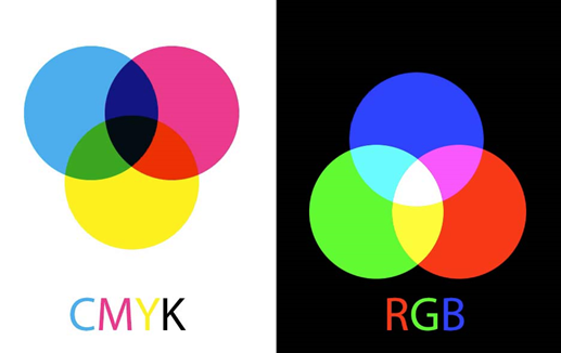
Figure 1: CMYK vs RGB color representations. Credit to: Steve Caplin at creativepro.com/understanding-difference-between-rgb-cmyk/
Contrast this with most printed products like office documents or packaging, which use a subtractive AKA reflective color space like CMYK. The component colors of Cyan, Magenta, Yellow, and Black are overlayed on a white background. We perceive the colors only when light is reflected off the colored surface.
But even with these 2 basic models of color, a lot of what we see in the real world is dependent on the individual display or the paper and ink that was used.
3 Factors to Consider for Color Matching in Hardware

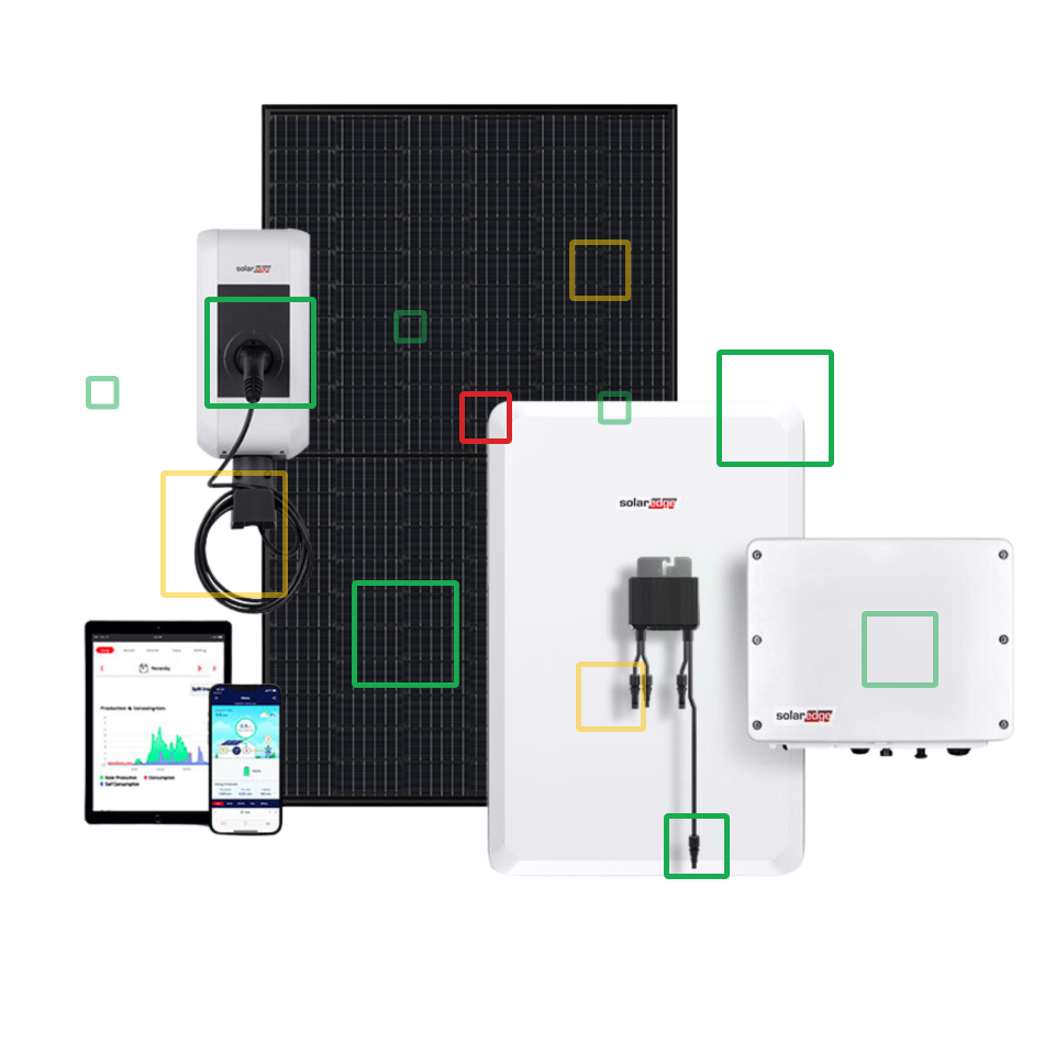
Figure 2: Different teals to match different materials.
The teal in the PillDrill product was designed into everything from the soft-touch painted main housing, bare plastic container lids, a rubberized TPU strap, silk screened plastic sheets, and pad printed logos, not to mention the different uses in the packaging and our digital companion app! After days spent at different factories in China, I learned about the following key aspects of color in manufacturing.
Materials, Processes, and Finishes:
Metals, plastics, and paints have their own inherent color characteristics. Different alloys and additives also influence their final coloration. High-heat and pressure processes like injection molding, casting, or forging can change material properties, which can affect color as well. Different surface treatments, such as brushing or mirror-polishing, influence the gloss levels of a part. Secondary treatments like paint can cover a surface, while anodization or PVD serve to tint the surface while retaining the base material look.
If your product has a mix of several of these surfaces, make sure you see what the components all look like together before signing off on any one part. Any imbalance can throw off your capacity to color match entirely.
Light Sources and Color Matching:
Typical daylight in North America has a color temperature of around 6500 kelvin; elsewhere in the world, it may be a warmer 5000k. If you’ve ever spent time on a factory floor in Asia, you know that most of them don’t have clear blue skies with ample sunlight to replicate a consumer environment. If your product is designed to be used indoors or at night, consider observing part samples at even lower temperatures like 4000k or 3000k.
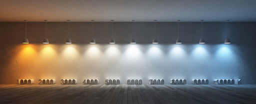
Figure 3: Color temperature from warmer to cooler: Credit www.gadunky.com/colour_temperature_guide/
With the pandemic limiting travel, have parts from the same batch sent to your local teams so they can review the colors in person under typical lighting for the region.
Measurement and Color Matching:
When you produce a colored part, you need an accurate and consistent way to measure color. A D65 or D50 light box (65 stands for 6500k while 50 is 5000k) allows you to view parts and products under reproducible lighting conditions. The CIELAB color space sometimes referred to as L*a*b* or simply Lab measures three parameters of L* (lightness from black to white), a* (from green to red) and b* from (blue to yellow). Color meters can return measurements of L* a* and b* values, and calculate a root sum square differential known as Delta E compared to a standard color reference. Delta E readings of < 1 are imperceptible to the human eye. Generally < 1.5 is reasonably controllable and barely noticeable. If you want to measure the consistency of a high-gloss part, a gloss meter measures the amount of light reflected off the surface.
Tips for a smoother rollout
2020 has been a sobering reminder that the brute force method of parking myself at the vendor sites until they got it right would not even be possible today. If flights had been grounded back then, who knows what color products our customers would have received? So what would I do if I could go back?
I’d create a plan to make sure the product colors were easily producible and measurable and it might go like this:
- If you have limited resources or time, select initial colors from a curated well-known color system like Pantone. This is an accessible color standard that most vendors know. If color is important to your brand, make sure you have enough resources to follow through on all the work involved.
- Have your vendors create color chips in the materials and processes that you plan to use making sure to understand the manufacturing tolerance limits for the additives or dyes or finishes. If it’s possible, ask them to produce a range of colors or run their processes a few times to account for possible variation.
- Once a color is selected, make several sets of chips so that they can be provided to vendors throughout the supply chain. (Make extra, as color chips are notorious for disappearing or changing with time and use.)
- Measure those chips with a color meter and set variation limits for quality inspections throughout the supply chain.
- Run long-term reliability tests to understand how things might change in harsher use cases, say under UV light for 72 hours, and set limits or adjust processes as needed.
Do you have any “colorful” stories about your products? Let us know at communications@instrumental.com.
Author
Related Topics