

Support / How Do I Investigate Potential Root Causes?
Utilize Instrumental’s Correlations feature to jump start your root cause analysis process.
Instrumental’s Correlations feature allows users to generate comprehensive correlations results in minutes, using all of the data available in the Instrumental application. This includes any data uploaded through Instrumentals’ API, as well as results from Instrumental’s other features; Discover, Monitor, and Measurements.
The Correlations UX makes it easier than ever to control how you generate your correlation, through a guided workflow. And you can quickly understand key takeaways and recommended next steps with the Correlations Summary that can be easily shared with your team.
Our new Deep Visual Correlations product finds distinct visual populations that correlate to functional failures – allowing you to identify common assembly variations that affect your product’s performance.
This article describes how to set up, modify, and utilize a correlation run.
Table of Contents
- Classifications
- Correlations Base Page
- Set up a Correlation
- Deep Visual Correlations
- Correlations Result Page
- Sharing Results
- Modifying Correlations
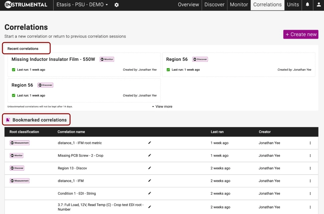
The Correlations Base Page
The Correlations Base Page is where you can access all of your previous Correlations, in one convenient location. You can access it through the top Navigation bar in the application.
The top of the page lists your recent correlations – saved for two weeks. The bottom of the page holds Bookmarked Correlations, which are saved indefinitely as long as they are bookmarked.
Classifications
Instrumental’s Correlations product uses Classifications to group similar data metrics together, in order to create the structure used in the Correlation Results and Summary pages.
There are currently three Classifications that can be assigned to uploaded metrics:
- Functional Tests – any tests used to determine the product’s functionality
- Upstream Supplier – information about the suppliers of the component parts of the unit
- Other – a catch all for all other data metrics
If you have feedback on these Classifications, or believe we should add more please reach out to your Customer Success Manager or Solutions Architect.
Updating Classifications
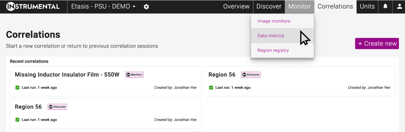
You can update which classification your data metrics are assigned to on the Data Metrics Page. You can access the Data Metrics Page by hovering on the Monitor tab, as shown in the image below.
In order to update your classification assignment:
- Click “Update Classifications” on the left hand side of the page.
- Select which metrics you wish to reassign
- Choose the desired Classification
- Click “Finish Updating”
All Metrics are assigned the “Other” Classification upon initial integration and upload. Measurements, which are also visible on the Data Metrics Page, cannot be reassigned to another Classification.
Set Up a Correlation
In order to set up your correlation, you will need to:
- Choose a Root Metric
- Select the Predictor Metrics
- Choose Correlation methods and time period
- Wait for your correlation to generate
Choose a Root Metric
The Root Metric of a Correlation is the metric you are investigating during your Failure Analysis process. In this example, the Root Metric is a Functional test checking the temperature on a power unit that is failing at an unacceptable rate.
You can choose the Root Metric that you want to investigate in three locations in the app.
- Units Tab – Click on the Metric Name
- Metrics List – Click “Correlate” on the Metric Card
- Correlations Tab – Click “Create New” and search for your desired metric
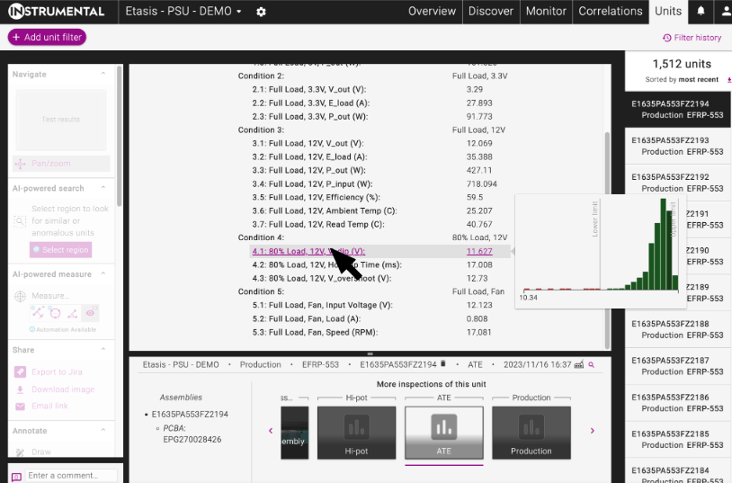
1. Units Tab – Click on the Metric Name
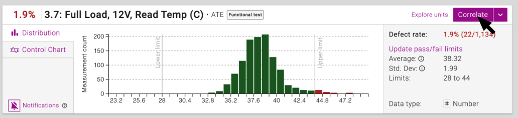
2. Metrics List – Click “Correlate” on the Metric Card
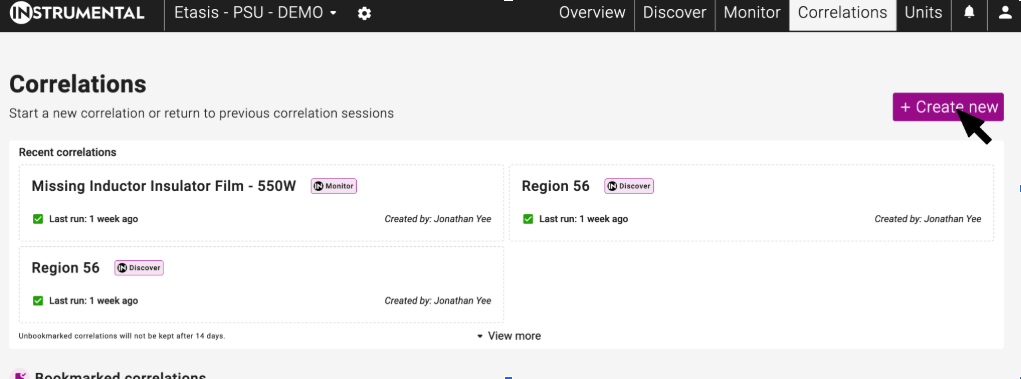
3. Correlations Tab – Click “Create New” and search for your desired metric
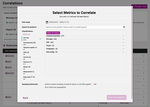
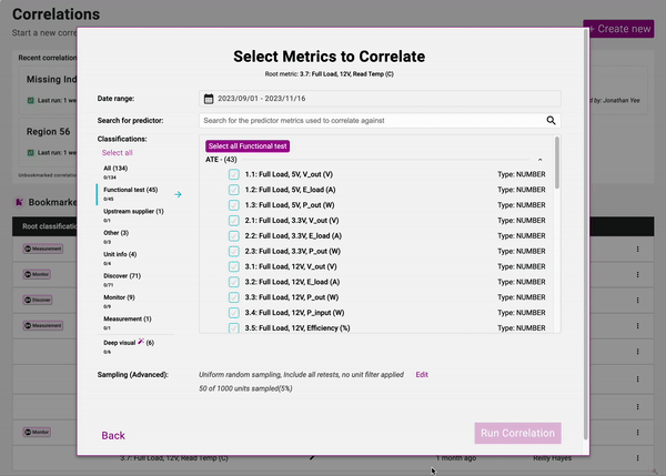
Select Predictor Metrics
Predictor Metrics are the metrics and potential root causes you want to correlate your root metric against, in order to try and find the root cause of your failures. Predictor Metrics are organized by their Station by default in the “All” Grouping.
Below the “All” Grouping, Metrics are organized by their Classification on the left hand side of the modal.
You can Select All available Metrics by clicking the “Select All” button on the “All” Grouping; Instrumental recommends running a correlation against “All” of your metrics on your first correlation to your Root Metric, to generate a comprehensive first pass root cause analysis. You can also select all metrics in a Classification, or all metrics in a Station, for a more focused investigation.
Choose Correlation Set Up Methods
Once you have selected the metrics you wish to correlate against, you can choose exactly how you want to run your correlation. You can select:
- Date – determines which Serial Numbers to use to generate the correlation
- First Test/Last Test – choose whether to use the first response to each test, the last response to each test, or every response to each test, where units have been retested
- Unit Filters – filter the data set you have selected further, using Unit filters, as you can elsewhere in the application
- Sampling Method – which sampling method to use on the data set you have selected to generate the correlation.
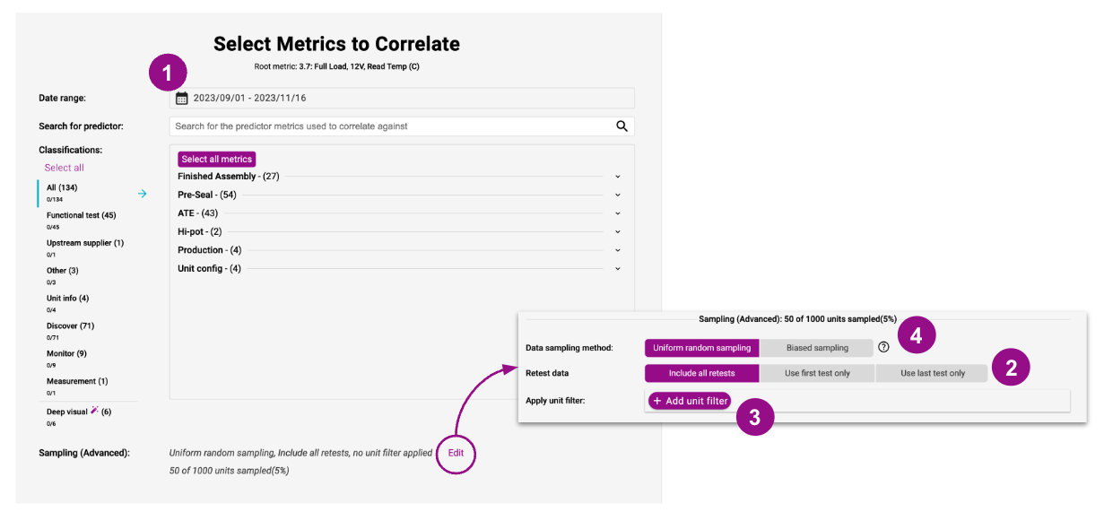
Random Versus Biased Sampling
There are two distinct sampling methods that can be used to generate a correlation within Instrumental.
Random Sampling – the system will select a subset of units randomly, which is more likely to be representative of the original dataset’s population.
Biased Sampling – the system over-selects from the failing population, attempting to select a subset of the population that fails at a higher rate than the original dataset population. Instrumental’s biased sampling attempts to create a ratio of 1:5 for failing:passing units.
Wait for your Results to Generate
Once you’ve pressed “Run Correlation” the hard work is done. You can wait on the loading page to view results if you like, or you can leave the page, and return to the Correlations base page to access your results later.
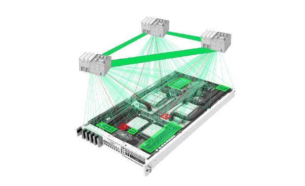
Deep Visual Correlations
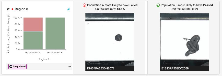
Instrumental’s Deep Visual Correlations product uses AI in order to identify distinct visual populations that correlate to functional failures.
In order to run a Deep Visual Correlation; you must use a Root Metric that has passing and failing limits set. You can set your passing and failing limits on the Data Metrics page if you have not done so already.
Once you have chosen your root metric, you can select the Deep Visual Correlations Tab on the left hand side of the predictor metrics Modal.
Then, select which image types to use to run the correlation. The grey and blue squares overlaying the image indicate which regions will be used to generate the results. If you are concerned that there is not enough coverage of your images, let your Customer Success Manager know, and they can increase coverage.
Deep Visual Correlation results are always generated from a biased sample of 500 units, in order to deliver the best results.
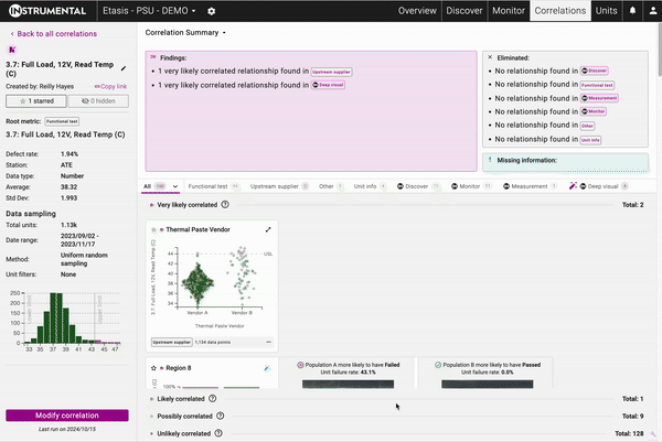
Correlations Result Page
Once the Correlation is complete, results will appear on the Correlation Result Page. There are three main areas on the Result Page that communicate key information about the Correlation itself.
- Correlation Summary
- Individual Relationships
- Left Hand Side Metrics Information
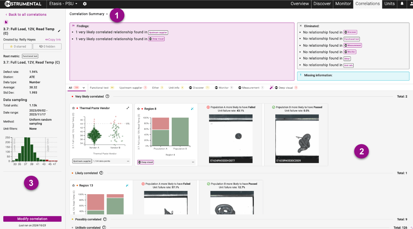
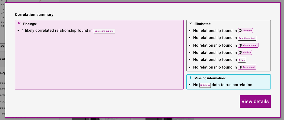
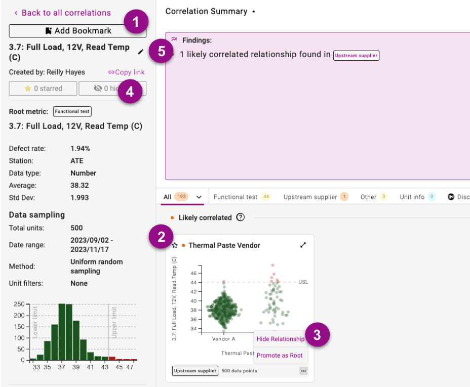
Correlation Summary
The Correlation Summary appears on the initial load of the Correlation Result page, and indicates key takeaways and recommended next steps from the overall correlation run. There are three groupings within the Correlation Summary:
- Findings – which Classifications have “Very Likely” or “Likely” correlated relationships, and should be investigated further.
- Eliminated – which Classifications only have “Possibly” or “Unlikely” correlated relationships, and can be deprioritized for further now
- Missing Information – which Classifications were not run: either because they were not selected, or because there is no data in the app with that Classification, and Instrumental recommends uploading more data to ensure that potential root cause area has been de-risked.
The Correlations Summary is always visible at the top of the Correlations page, but can be hidden by pressing the arrow icon to the right hand side of the Correlations Summary title.
Individual Relationships
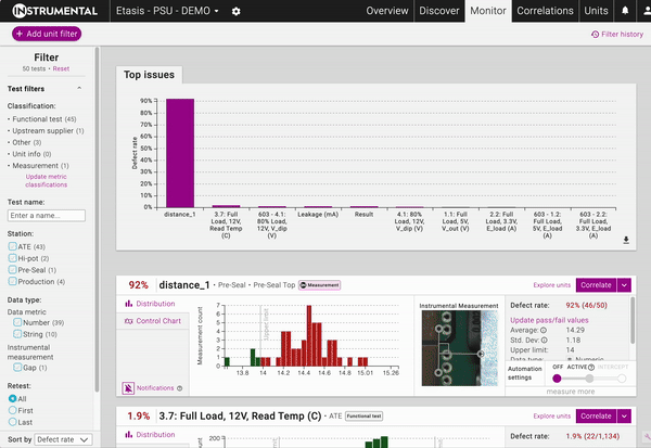
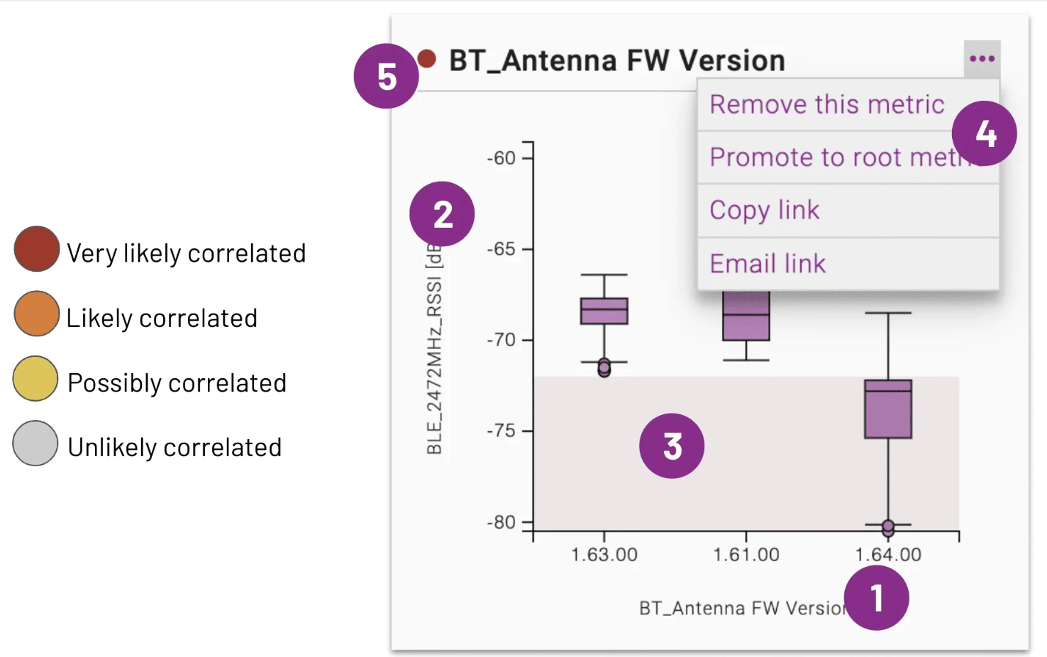
Each unique combination of Root Metric/Predictor Metric will have its own dedicated Relationship Card. Relationship cards are a visualization of the relationship between the root metric & a predictor metric. The charts are ordered by the strength of the relationship, and are grouped according to that strength. (Very Likely Correlated, Likely Correlated, Possibly Correlated, Unlikely Correlated)
- Predictor Metric: X-Axis
- Root metric: Y-Axis
- Failed units: Plotted in red chart areas
- Chart actions: Investigate further and engage others
- Correlation strength indicator
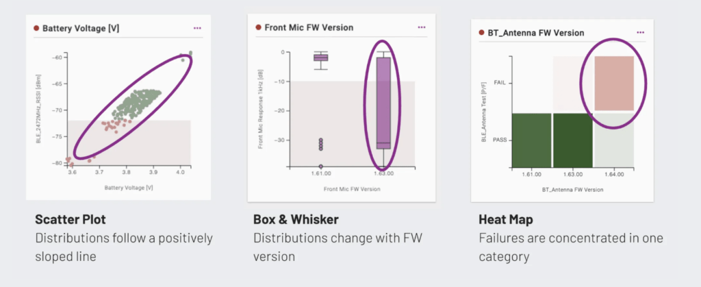
The type of chart changes with the types of data and amount of data. Below are conditions for using each type of chart:
| Number | Category | Date | |
| Number | Scatter plot / heatmap | Box plot | Scatter plot / heatmap |
| Category | Box plot | Heatmap | Heatmap |
| Date | Scatter plot / heatmap | Heatmap | Not supported |
In the case of Number vs. Number and Number vs. Date, a scatterplot is used unless there is too much data to plot every individual point. If there is too much data, the points are aggregated into a heatmap.
Generally, you should look for charts where the selected metric (X-Axis) appears to affect the values of the root metric (Y-Axis). For example, all of the below are highly correlated:
Specific Relationship Cards can be found easily by using the Classification tabs found just below the Correlation Summary.
To get a more detailed view of the Relationship Card, press the expand icon in the top right corner of the relationship.
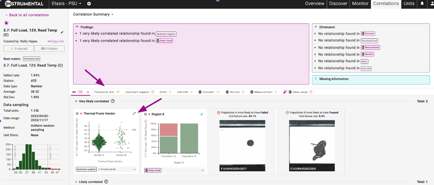
Monitor, Discover, and Measurement Relationship cards also contain visual examples of passing and failing units, which can be accessed by clicking on the bottom of the card on the All Tab, or by viewing the relationship in each Classification tab.
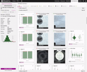

Deep Visual Correlation Relationships also contain visual examples of each distinct population that has been identified by the AI. The bar graphs on the relationships represent the relative failure rate of each of the populations.
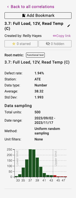
Left Hand Side Metrics Information
On the left hand side of the Correlation Result page, there is a summary of how the Correlation you see presented was generated. It lists the Root Metric name, information about that root metric, and what parameters were used to run the correlation.
Sharing Results
When you have found something interesting in a correlation, it’s easier than ever to share fully contextualized results with your team.
Actions Available:
- Bookmark Correlation – For Correlations that have been shared with your team, or could be returned to over time, you can use the “Bookmark” function. Correlations that have been bookmarked will be saved indefinitely.
- Star Relationships – if there is something interesting found in a specific correlation, star that relationship, and access it from the dropdown on the Correlation Result page.
- Hide Relationships – if you find that there is a relationship that is irrelevant, or creating noise on the results page, you can hide it from the All Tab. These relationships will still be available for review in the Hidden dropdown on the Correlation Result Page.
- Copy Link – Use the convenient “Copy Link” icon to copy the url of your Correlation result to your clipboard
- Rename – To differentiate correlation runs with the same Root Metric, rename each result page with a unique identifier, so they are easier to identify later.
Modifying Correlations
When the results of a correlation are unexpected, it’s easier than ever to change your correlation set up methods.
Click on the “Modify Correlation” button in the right hand corner of the Correlation Result page to update your correlation.
You can choose to overwrite the current result using the “Re-Run Correlation” button, or you can save the modified correlation run as new.