


Support / How do I monitor the performance of functional tests and measurements?
Once functional test and measurement data is in the system, you can use the Data metrics page to view summary statistics for each metric and to find areas to improve. The Data metrics page is essential for prioritizing your failure analysis activities and as a central source of truth for your project’s data.
Table of Contents
Accessing the page
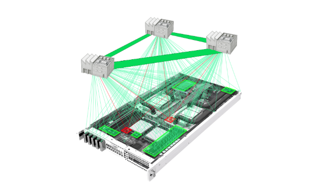
Under the Monitor tab, click ‘Data metrics’:

Finding top issues
At the top of the Data metrics screen is a Top Issues Pareto chart, where metrics that have passing/failing thresholds will be ranked by their defect rates. By default, the defect rate is calculated as the number of failing inspections divided by the total number of inspections for each test. You can use the Retest filter in the sidebar to look at only the first or last test of each unit if you prefer.
Click on any of the columns in the Top Issues Pareto to navigate to the Correlations screen to begin your failure analysis.

Metric details
Each metric has its own card with actions, summary statistics, and a distribution plot of the metric’s values. Numeric metrics also have a control chart.
The actions include viewing units with that particular measurement in the Explore screen, opening the Correlations screen with this metric selected as the root metric, and sharing links to the metric with colleagues. For metrics with a Number data type, you can also subscribe to receive alert emails in the event of an SPC Rule violation (see below).

Within the Metric Card is a visualization of the metric’s data. With this you can quickly understand how your data is distributed and spot abnormalities. For example, you may want to identify any metrics that appear to have a non-normal distribution for investigation.
The Distribution charts show a histogram of the values (i.e. the bars show the number of inspections for each value or bin). Numeric metrics are binned, and the number of bins are chosen to try to reveal the shape of the data around the mean. Boolean and String metrics show each value separately, with an Other category if there are too many Strings to illustrate. Date metrics are binned by day.
You can hover, click, or drag on charts to reveal more information and to drill into or filter on selected data.
The numbers and charts for each metric respect the filters in the unit search bar at the top as well as the left sidebar (e.g. the retest filter).
Control Charts
For metrics with a Numeric data type, the option to view Control Charts will appear below Distribution. Control Charts are tools to visually understand if you have a stable, predictable process. The charts include a plot of average values over time (in purple) with upper & lower control limits (the dashed red lines):

Control limits are different than the Spec limits that you can set in the pane on the right. Best practice is not to show spec limits on control charts because spec limits are for individual measurements and control charts show the average measurement value in each time period. The appropriate spec for such an average is different from the appropriate spec for individual measurements. You can think of control limits as being the appropriate spec for averages.
The formulas for upper and lower control limits for a given subgroup are:
- Upper Control Limit: Average + 3*(Std. deviation) / √ (# measurements in subgroup)
- Lower Control Limit: Average – 3*(Std. deviation) / √ (# measurements in subgroup)
Where:
- The average and standard deviations used in these formulas are calculated over 100% of the data in the chart (i.e. they do not include historical data from before the time period displayed on the chart). This is different than the average and standard deviation displayed in the pane on the right; those statistics are over 100% of the data for the metric over all time.
- The subgroups (i.e. the time periods) on the x-axis can be configured to 15 minute, hour, or day intervals on the Project Settings page. Because the number of measurements in each subgroup can vary, the upper and lower control limits can also vary for each subgroup. This is why the red dashed lines are sometimes squiggly. Instrumental’s control charts use this type of subgroup because Instrumental generally collects inspections on 100% of units, even at large scale. Subgroups with a fixed number of measurements, which may be more familiar to some users, are often computed using sampling and so are less accurate, or they are based on unit sequences rather than time which can result in showing data over an unreasonable period of time (e.g. for only a few minutes or across multiple builds) without making that caveat clear.
- Dividing by # measurements in subgroup ensures that SPC Rule violations do not occur too frequently for smaller subgroups. Intuitively, if you have a lot of data, each new measurement won’t cause the average to move much, whereas if you have only a few inspections, each new inspection will move the average more.
Note that control limits are mainly helpful for understanding the stability of metrics whose data is roughly normally distributed. You can use the Distribution chart to check if this is the case.
SPC Rule Violation Notifications
Control Charts can also indicate when a Statistical Process Control rule has been violated. These rules capture statistically improbable events. SPC rule violations are highlighted on the chart as red points instead of the usual gray. You can hover, click, or drag on charts to reveal more information and to drill into or filter on selected data.

Instrumental looks for 4 types of violations:
- Outlier: One point is beyond the 3-standard-deviation control limits
- Shift: Nine points in a row are on the same side of the centerline
- Trend: Six or more points are continually increasing or decreasing
- Over-control: Fourteen points or more are alternating in direction, increasing then decreasing
To receive an email when one of the above violations occurs, click the bell icon in the bottom left of the metric’s card. These notifications are specific to your account and will not affect other users in your Instrumental project. The email will look like this, from Instrumental Support

Clicking ‘INVESTIGATE’ will bring you to the Correlations screen with the relevant metric selected as the root metric. If you are receiving too many notifications for this metric, you can unsubscribe in one click by clicking the link in the bottom of the email.
Note that the SPC rules are most helpful for understanding the stability of metrics whose data is roughly normally distributed. You can use the Distribution chart to check if this is the case.
Process Capability Indices
For any metrics with a Numeric data type and both upper & lower Pass/Fail limits set, Instrumental displays Cpk and Ppk in the pane on the right. (Cpk and Ppk are the names of the statistics, not acronyms.) These indices are used to predict whether a manufacturing process can repeatedly produce results that meet specifications. Cpk is a measure of process capability (“is this process likely to meet the spec”) and Ppk is a measure of process performance (“does the process actually meet the spec”).
Lower values mean processes are less capable, while higher values mean they are more capable. For example, values under 1.0 are commonly considered “not capable.” Depending on your quality requirements, it is common to have targets of 1.33, 1.5, 2.0, or even higher.
To calculate Cpk and Ppk, the following formulas are used:
- Cpk = Minimum(Cpu, Cpl)
- Cp = (Upper Spec Limit – Lower Spec Limit) / (6 * estimated Standard Deviation)
- Cpu = (Upper Spec Limit – Average) / (3 * estimated Standard Deviation)
- Cpl = (Average – Lower Spec Limit) / (3 * estimated Standard Deviation)
- Estimated Standard Deviation = sample size weighted standard deviations across subgroups
- Ppk = Minimum(Ppu, Ppl)
- Pp = (Upper Spec Limit – Lower Spec Limit) / (6 * Standard Deviation)
- Ppu = (Upper Spec Limit – Average) / (3 * Standard Deviation)
- Ppl = (Average – Lower Spec Limit) / (3 * Standard Deviation)
The average used for Cpk and Ppk is for the population, i.e. the data for all time that matches the search filters. The main difference between Cpk and Ppk is that Ppk uses the population standard deviation and Cpk uses a standard deviation based on the data that’s visible in the chart. The average for Cpk and Ppk, as well as the population standard deviation used for Ppk, are the same as the average and standard deviation statistics displayed next to the Cpk and Ppk. Each of these statistics are most useful when the population data is normally distributed.
The estimated standard deviation used for Cpk is calculated as follows:
- d = (sum of measurement count in subgroups) – (number of subgroups)
- w = sum(((measurement count in subgroup) – 1) * (variance in subgroup))
- Sp = sqrt(w / d)
- x = (d – 1) / 2
- C4 = sqrt(2 / d) * (x^2 + x/2 + 1/8)^(1/4)
- Estimated standard deviation = Sp / C4
Filters
All of the data shown on the Metrics screen can be filtered using Unit filters. This can be particularly helpful if your product has multiple SKUs, configurations, or multiple assembly lines.

You can also filter which Metrics are shown in the Top issues Pareto and their sort order. Use the filters on the left of the screen to find metrics by their name, Station, or Data Type. There are also controls to view only first tests, final tests, and to change the sort order of the metrics.
