


Support / How do I see functional test failures and find their root cause?
When you find out that units are failing a particular functional test the issue may take days or even weeks to investigate. Between the back-and-forth required to get the right data, time spent wrangling data into a usable form, and the work to analyzing the many potential root causes, the path to resolve an issue can be messy and unpredictable.
Instrumental Data Streams simplifies this process by collecting all of your data in one place and making it easily searchable, viewable, and exportable. Instrumental Correlations speeds up analysis by providing one-click, AI-driven insights into which physical areas of the product are most related to functional test results.
Table of Contents
Find a unit of interest
Let’s say you’re alerted by your factory team that there are failures in mic testing. To investigate, start on the Explore page. Find units with relevant functional tests by clicking the purple + Add Filter button in the search bar and searching for “Measured feature starts with Front Mic.” (You can also search for specific test values, e.g. “Front Mic Functional Test [P/F] value = FAIL”.) Then, in the gallery tray at the bottom, click on the inspection with the relevant test – in this case “Final Functional Test.”
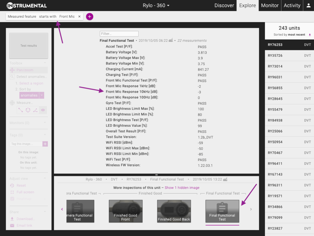
Review the relevant inspection
Type in the “Filter” textbox to filter to just “Front Mic” tests, then hover over each test to see the distribution of values across all units. The bar in which the hovered value falls will be a darker color.
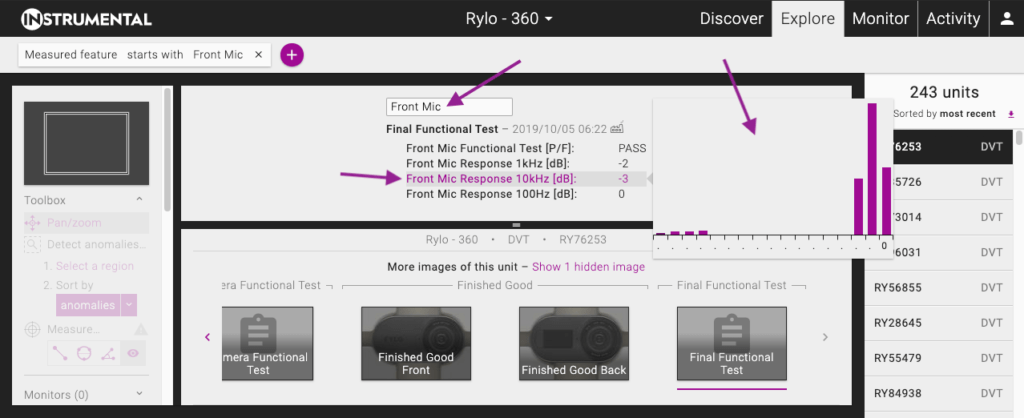
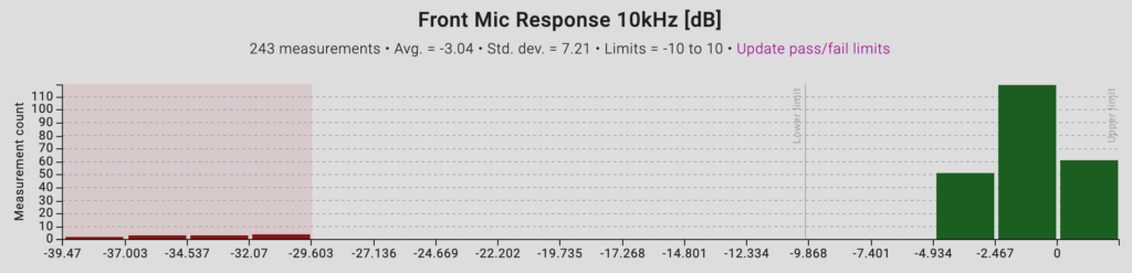
In this case, the Front Mic Response 10kHz [dB] test clearly has some outliers, consistent with the factory’s report of failures. Let’s click into it to investigate why those outliers are failing.
Search for correlated tests and measurements from Data Streams
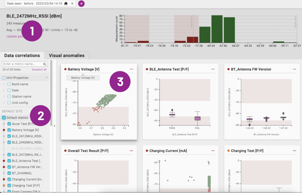
Clicking the test will bring you to a page that shows some information about the test at the top and allows you to explore visual and data correlations at the bottom.
The Data Correlations tab enables you to quickly identify if there are any strong correlations between variables in your manufacturing dataset. Without needing an advanced statistical background, you can see if functional failures are potentially caused by other tests and measurements imported into Instrumental.
At the top, you’ll see a histogram of test values as well as some statistics about the distribution. This is called the “root metric” in the app. Typically you will be trying to investigate what is causing failures for this test, but you can also see what failures it might be causing in other tests.
On the left, you can select entire test stations and/or individual tests to use in your correlations analysis. Each selected test will generate a chart that visualizes the relationship between it and the root metric.
- Root metric: What’s causing units to fail this test?
- Metrics Panel: Select what metrics to visualize against the root metric.
- Correlation Chart: A visualization of the relationship between the root metric & a selected metric. The charts are ordered by the strength of the relationship.
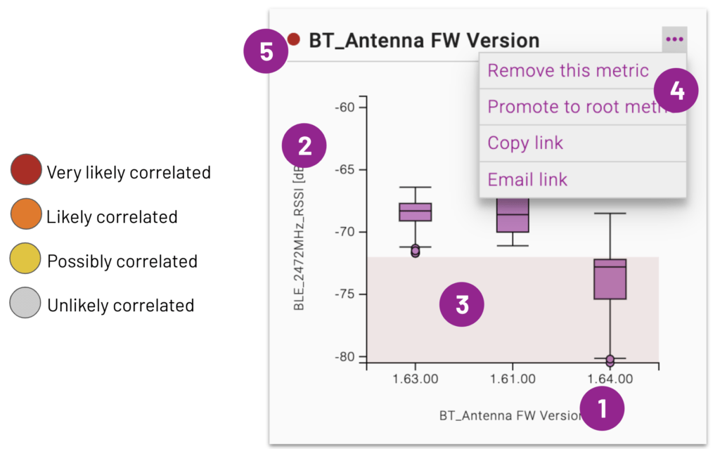
The charts will be ordered by the strength of the correlation to the root metric, which is also indicated by the colored dot to the left of the chart titles.
- Selected metric: X-Axis
- Root metric: Y-Axis
- Failed units: Plotted in red chart areas
- Chart actions: Investigate further and engage others
- Correlation strength indicator
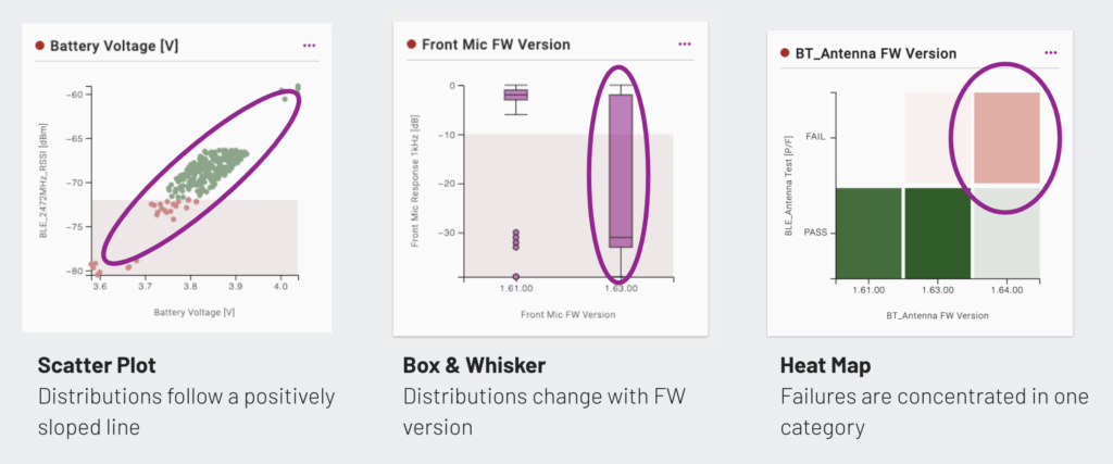
The type of chart changes with the types of data and amount of data. Below are conditions for using each type of chart:
#data-rel-chart-type-table { border-collapse: collapse; margin: 15px auto; } #data-rel-chart-type-table th { background-color: #DDDDDD; } #data-rel-chart-type-table th, #data-rel-chart-type-table td { border: 1px solid #CCCCCC; padding: 5px 10px; } #data-rel-chart-type-table tbody th { text-align: left; }
| Number | Category | Date | |
|---|---|---|---|
| Number | Scatter plot / heatmap | Box plot | Scatter plot / heatmap |
| Category | Box plot | Heatmap | Heatmap |
| Date | Scatter plot / heatmap | Heatmap | Not supported |
In the case of Number vs. Number and Number vs. Date, a scatterplot is used unless there is too much data to plot every individual point. If there is too much data, the points are aggregated into a heatmap.
Generally, you should look for charts where the selected metric (X-Axis) appears to affect the values of the root metric (Y-Axis). For example, all of the below are highly correlated:
If you discover an interesting correlation, you can share this with colleagues either by email or sending a link to your finding using the actions menu in the upper right of the chart.
Search for related regions
If you switch to the Visual Correlations tab, you can see which components’ visually detectable anomalies are most related to the root metric:
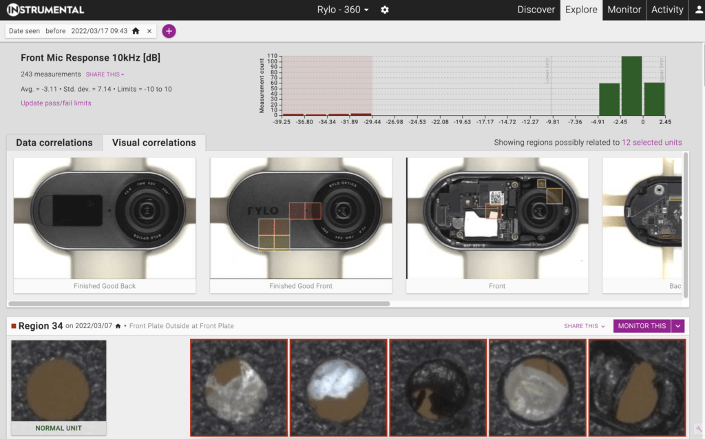
Without any human guidance, this page automatically detects physical areas of the product that are correlated with test outcomes.
At the top, you’ll see the same histogram of test values as well as some statistics about the distribution. The page automatically selects failing units or outliers for you, but if you want to change the selection you can click or drag on the chart to select specific values. Selected bars have a darker color and a highlighted background.
Below the histogram, you’ll see a heatmap highlighting regions of the product that may show root causes of the functional test failure. Below that is more detail on each region that is highlighted in the heatmap, ranked by how correlated the region is to the units selected in the histogram. You can click or drag on the heatmap to filter the region suggestions to the selected product area. Within each region suggestion, the units with functional test values selected in the histogram will be highlighted in red.
Each suggested relationship can be expanded to see more example photos and a minimap illustrating where on your product the displayed region is located. You can also toggle a mode that highlights differences between the anomalous examples and normal units. This mode is helpful if it’s not clear why a suggestion is highly ranked.
In this case, you can see from the top result that Instrumental detected that a likely cause of mic failures was mic port contamination. It may seem like a pretty straightforward guess, but recall that no human guidance was required to tell the system where the mic port physically is on the product or that it’s connected to “Front Mic Response” tests. Instrumental’s AI can make deductions like this even in more complex situations, such as a bent wire affecting wifi antenna power.
Instrumental’s AI detects these relationships by calculating how often physical features detected in photos appear in the units selected on the histogram compared to the rest of the units.
Test limits
You can tell Instrumental which test values are passing or failing by setting limits. If a test already has limits, the passing values will be green on the histogram, the failing values will be red, and unspecified values will be gray. The limits will also be shown with the statistics in the top section of the page and there will be an “Update pass/fail limits” link. Otherwise, the bars on the chart will be purple and there will be a “SET PASS/FAIL LIMITS” button. In addition to visually clarifying the results, setting test limits affects which bars on the chart are selected by default when you first load a test’s Relationships page.
You can set or change limits in the web app by clicking the Set/Update button as applicable. If you change limits, the newest settings persist for all users throughout the app. Limits can also be submitted alongside the test data. Limits apply only to the Instrumental app and do not propagate back to the assembly lines.

Drive corrective action
Once you’ve identified a correlation that explains a functional test failure, there are several next steps you can take to fix the problem.
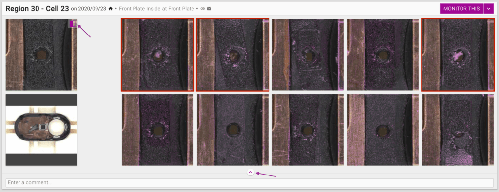
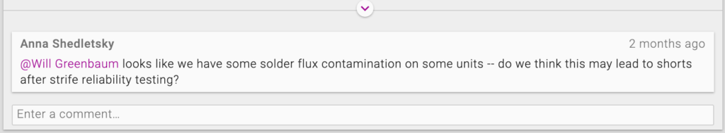
For visual correlations, the easiest option is to add a comment on the region suggestion and @mention others to request input. When you @mention teammates, Instrumental will send them an email with your comment and a link to the relationship. Use comments to add notes as you investigate an issue or to ask colleagues to get involved.
Another option is to share a link to the relationship directly. For visual correlations, one way to do this is to click or drag on a heatmap to filter to the region of interest, then share the page’s URL. You can also use the “Direct link” or “Email link” buttons next to the region’s name. For data correlations, you can share a link to a specific relationship from the “…” link on the relevant chart card, or from the “Share this” dropdown at the top of the page.
Finally, you can set up a monitor to automatically identify new units with visual defects. This will allow you to name the issue, track its frequency in your Pareto charts, assign an owner, and generate PDF and CSV reports. You can also set monitors as “Live On-Station” pass/fail tests to intercept defects in real time on your line. And you can configure alerts to get notified when a monitor catches defects. To get started, click the purple MONITOR THIS button on the region suggestion card or on a specific thumbnail that illustrates the issue, then follow the prompts to configure it. This works just like on the Discover page, so for a walkthrough, you can review the documentation for creating a monitor from a discovery.
FAQ
How are Visual Correlations detected?
Instrumental’s AI looks at practically every area of practically every photo from the assembly process and compares the distribution of visual features to the distribution of the functional test you are investigating. Essentially, if units that fail the functional test look different than units that pass it, Instrumental will suggest that it is worth considering if that visual difference could show a cause of the test failures.
Why isn’t a region/metric I expect to be related showing up in the results?
In order for Correlations to find a correlation, there has to be enough data to correlate. If there are only a few test failures, then the concept of a relationship is not especially meaningful.
If you are encountering other challenges, reach out to your account manager with a link to any unsatisfying results.
How do I submit a feature request or get additional help?
Use the “Send feedback” link in the account menu or contact your account manager to discuss. The feature you are interested in may already be planned.